10/13/13
Motion Graphics Exercise: The Square
Ottawa Pop Expo Logo
As requested by the client, this logo was based on the Montreal Comiccon logo, except instead of a man it's a woman, and instead of a star on the chest, it's a maple leaf. I was also asked to keep the logo as close as possible to the Montreal logo.
Lots of fun; I think the hardest part was getting the client to choose a hairstyle.
Labels:
illustrator,
logo
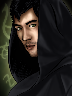
Mortal Instruments Trivia App
This is my first and latest trivia app for Siba Style. It was the first trivia app we did together (back in sprint 2012), but then decided we would release it closer to when the movie came out (more than a year later in summer 2013).
5/10/13
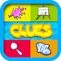
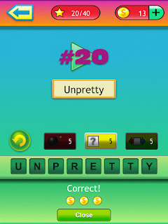
Doodle Clues
Like Memory Pictures & Puzzles I did all the visuals except for the doodles, which were done by the same guy that did the puzzles in Memory (again, school prevented me from having to do bulk illustrations). I'm particularly pleased with the icon since—don't know if anyone's noticed—the images I chose to include in the icon relate somehow to the name of the game.
Tidbit: My inspiration this time was Blues Clues (I think it's obvious why).
80s Music Guru
The second Music Guru Game. I'm very pleased with the way this one turned out. It's truly a culmination of everything I've learned and improved upon in my Illustrator course with Greg (i.e. graphic styles, patterns, gradients, appearance, transform effect). And the colours are yummy :)
Hip Hop Guru
The first of 3 music guru games (Siba Style again of course). These 3 games and Doodle Clues were all done back to back. It was at this time I started to really embrace graphic styles (thanks again to Greg).
Millionaire Pursuit
My first app after a short break, and the gradients are in full force! I think this was the first game where I made use of the gradient stroke in Illustrator (thanks to my teacher, Greg Treadwell for the lesson). It's also the first time in a long time that I ventured to use the gradient mesh tool. That was not easy. The first time I seriously used it was my first semester at Sheridan, and then it was a candy bar—text and all. And here I was struggling to do a ball, basically!
Life of Pi
I feel like this one was the fastest produced App I've done. I think after the previous two trivia games, which I did virtually at the same time, this one was a total breeze. The only thing that took any amount of time was the tiger, and even that wasn't too time-consuming. I might have to go back and do the unlockable illustrations some time though, but I'm not sure…
TV Theme Songs
A Siba Style game that the whole family can play! Unless they're really, really young, I guess. Loads of fun :)
Name the Designer: Shoes
Again, this one was done back-to-back with NTD: Handbags.
I don't mean to sound arrogant, but—even though I'd fail at playing the game—I'm so happy with the visuals. I love the stark black and white with punctuations of red, and I'm also very pleased with my shoe illustrations, both for the icon/title page and the unlockables. Gradients really are a beautiful thing when done subtly and correctly.
Subscribe to:
Comments (Atom)


